Ace Editor & Splitpanes CodePen clone
Live demo on Netlify | Github repository
Hello and welcome to the very first Weekly OverVue article! I'm Mac, and in this post I'll teach you how to build a minimalist, no-backend CodePen clone using Vue 3 (shocker!), TypeScript and Pinia, but also the aforementioned community components made by Carter Li and Antoni Andre respectively.
Preparing a strategy
While I'm confident you're familiar with this and similar applications, I believe it's better to reintroduce the concept so as to have a clear outline of core features we'll need to implement in our own version.
CodePen allows one to write HTML, CSS, and JavaScript code, and also preview its results directly in the web browser. This includes updating the website live, ie. as you modify said code. All that functionality combined makes for a perfect tool to instantly put up smaller proof of concept or tech demo websites, without the need to install a standalone code editor and to configure a dedicated server for such tiny projects.
Here’s a typical Pen view:
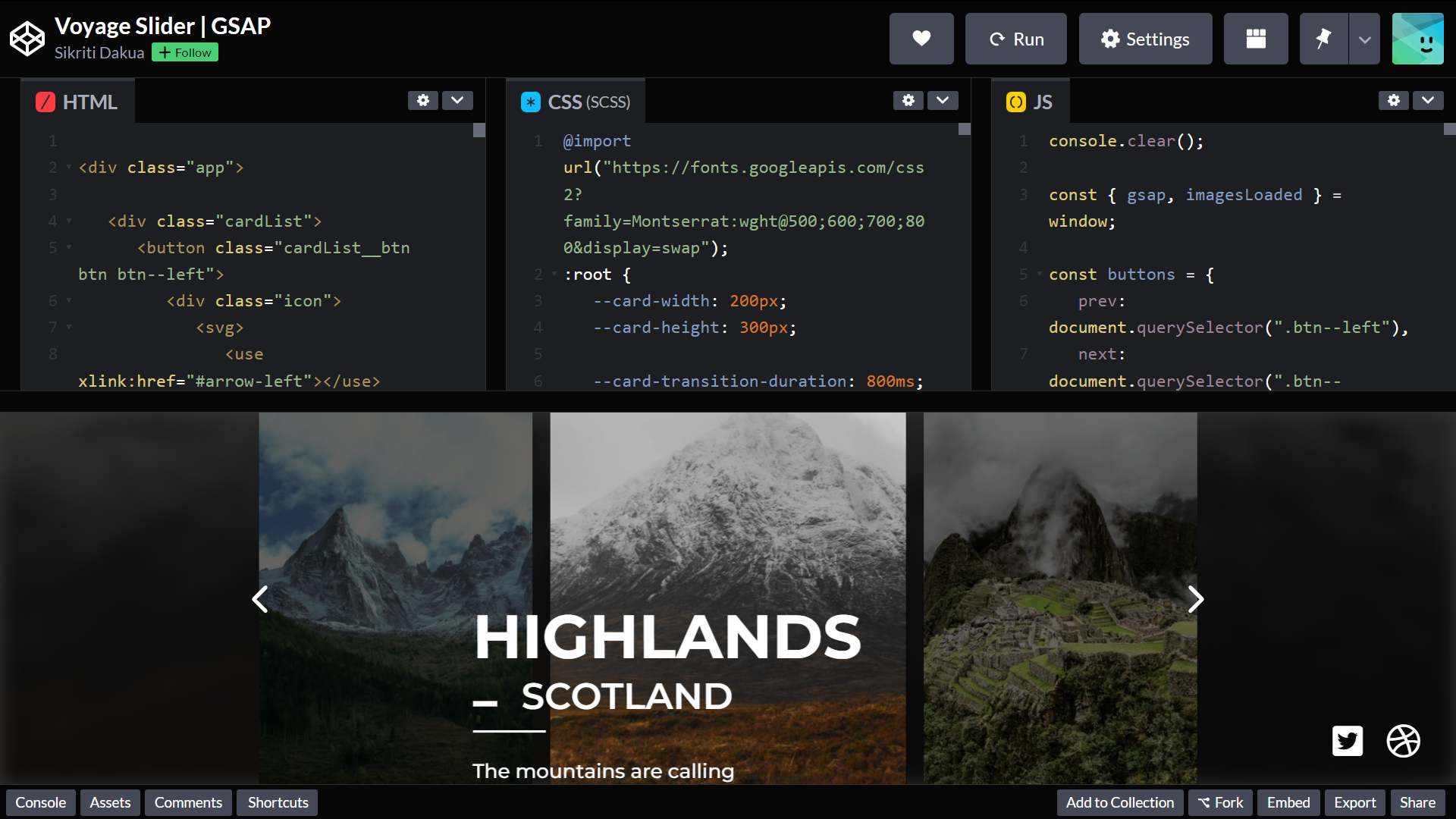
It consists of two main horizontal panels for code editors and the resulting webpage, with the former split into three vertical subpanels. By default, each panel takes up an equal amount of available container space, but it can be freely adjusted and resized to one’s liking. Obviously, there are alternative layouts too, but in this article I’m going to focus on the one I’ve just described.
Application setup
With a game plan in place, it’s time to bootstrap our Vue application. Now, if you’ve been carefully following Weekly OverVue on Twitter, then chances are you remember a tweet about the so called blank canvas templates. I’m mentioning this, because we’re about to use one for our CodePen clone. Open a CLI of your choice, and use these commands to clone the No Router template and install necessary dependencies:
$ git clone https://github.com/prevue-land/blank-canvas-no-router.git codepen-clone
$ cd codepen-clone
$ npm install
Right before you open up your favourite code editor/IDE (pronounced ˈvɪzjʊəl ˈstjuːdɪəʊ kəʊd), you’ll need to install the aforementioned splitpanes component library. As you’ve probably guessed (or looked up) by now, it enables us to implement... well, split panes interface, including support for both horizontal and vertical layouts, as well as nested panels plus out-of-the-box TypeScript support:
$ npm install --save splitpanes
Using splitpanes to form base layout
Once you’ve installed the package, we can finally start writing some proper code. Go to the main.ts file in the src folder and simply add the following import right below the existing ones. This file includes only the absolutely necessary styling for pane elements, leaving further customisation and theming solely to us.
import 'splitpanes/dist/splitpanes.css';
After that, head over to App.vue and remove everything inside <script setup lang="ts"> and <template> tags, as well as the entire main element styling rule. Then go ahead and import Splitpanes and Pane components in the aforementioned script tag by inserting:
import { Splitpanes, Pane } from 'splitpanes';
In case you somehow didn’t know: thanks to the setup attribute, we don’t need to add all the extra component definition and setup function boilerplate, essentially enabling us to write more concise code, but also providing us with improved type-checking and runtime performance.
Alright, next up is actually creating a layout similar to the CodePen one pictured above. Let’s begin by adding the main horizontal panes for editor and results zones in our template. Splitpanes component utilises the vertical layout by default, but we can switch to horizontal with... well, horizontal prop. Then you have to place two Pane elements inside the panels’ container, where the first one contains another Splitpanes element, but without the alternative view prop yet with three child Pane elements.
That’s quite a description, so here’s markup for reference:
<Splitpanes id="main-splitpanes" horizontal>
  <Pane>
    <Splitpanes id="editor-splitpanes">
      <Pane></Pane>
      <Pane></Pane>
      <Pane></Pane>
    </Splitpanes>
  </Pane>
  <Pane></Pane>
</Splitpanes>
Although we’re done with the skeleton (for now), we’re yet to properly style the panel splitters. Create a <style> element below the <template> tag, and add the following rules:
#main-splitpanes > .splitpanes__splitter,
#editor-splitpanes > .splitpanes__splitter {
  background-color: #35495e;
}

#main-splitpanes > .splitpanes__splitter {
  min-height: 3px;
}

#editor-splitpanes > .splitpanes__splitter {
  min-width: 3px;
}
There’s nothing particularly interesting going on here, so let’s just make sure to save these changes and type in npm run dev in the CLI. If you've done everything correctly, you'll be greeted with a dev server URL. Upon opening the page in your web browser, you should see something like this:
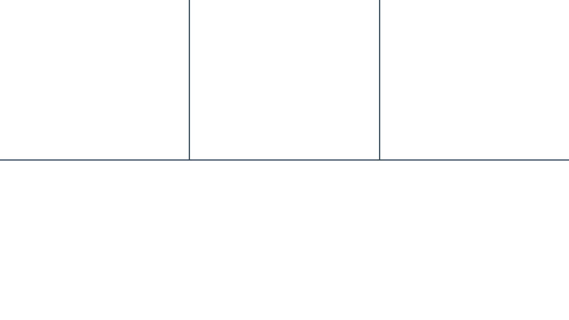
Now hover over one of these lines and hold your left mouse button. If it’s a vertical line, move your mouse to the left/right (or up/down for a horizontal line). That was pretty simple to implement and equally easy to use, wasn’t it?
Designing a global Pinia code store
Before we get down to integrating vue3-ace-editor with our application, we need to create a unified store for updating HTML, CSS, and JavaScript code of our resulting website, as well as its actual generation. Now, let’s break it down into every element it should consist of:
- ID:
code(surprise!) - State: in our case, we only need
html,css, andjavascriptproperties. I’m positive they speak for themselves - Getters: here I would suggest adding one called
resultingDocumentfor generating the page based on the aforementioned state, but alsoisEmptyDocumentto determine whether the total length of all these state properties (excluding whitespace characters) is equal to zero. If that computed value istrue, we’ll show some placeholder text instead of the resulting page - Actions: essentially take each state variable, prepend
set, make it all camelCase and there you have the actions. They’re pretty much self-explanatory too
This was the specification - time to convert it into actual code. Let’s start by creating a code.ts file inside the stores directory, then importing Pinia’s defineStore function and writing each store element’s type definitions:
import { defineStore } from 'pinia';

type State = {
  html: string;
  css: string;
  javascript: string;
};

type Getters = {
  resultingDocument(): string;
  isEmptyDocument(): boolean;
};

export type Actions = {
  setHtml(html: string): void;
  setCss(css: string): void;
  setJavascript(javascript: string): void;
};
Yes, Actions type export is 100% intentional and you’ll see why in a minute... Ok, next up is defining and exporting a useCodeStore composable returned by the aforementioned defineStore. It all boils down to:
export const useCodeStore = defineStore<'code', State, Getters, Actions>(
  'code',
  {
    // Snippets below
  }
);
When it comes to our state function, I don’t think I have to convince you to initialise the store with each property being an empty string, just like that:
// The root object here is defineStore's second argument
{
  state() {
    return {
      html: '',
      css: '',
      javascript: ''
    };
  }
}
Then we’ve got to write our getters: resultingDocument and isEmptyDocument. The former will return a template string with your standard HTML boilerplate, including css in a style tag, html directly in the body, and all the javascript code in a script tag directly before its closing. As for the latter, we need to sum each property’s trimmed text length and check if that total equals zero. Using String.trim() returns a string without the whitespace characters, so if a certain property consists only of spaces, line breaks and so on, trim will return an empty string. Here’s how our getters look like:
{
  // Remember: this is the exact same object as in snippet above
  // I omitted state to make this chunk more "digestible"
  getters: {
    resultingDocument() {
      return `
      <!DOCTYPE html>
      <html lang="en">
        <head>
          <meta charset="UTF-8" />
          <meta name="viewport" content="width=device-width, initial-scale=1.0" />
          <style>${this.css}</style>
        </head>
        <body>
          ${this.html}
          <script>${this.javascript}</script>
        </body>
      </html>
      `;
    },
    isEmptyDocument() {
      const totalTextLength =
        this.html.trim().length +
        this.css.trim().length +
        this.javascript.trim().length;

      return totalTextLength === 0;
    }
  }
}
And last but not least - actions
{
    // Just like above
  actions: {
    setHtml(html: string) {
      this.html = html;
    },
    setCss(css: string) {
      this.css = css;
    },
    setJavascript(javascript: string) {
      this.javascript = javascript;
    }
  }
}
We’re done with our Pinia store! We can move on to...
Laying foundation for our universal editor component
Obviously you can’t do anything in our app just yet, as there are no editors or proper preview panel available. Let’s take care of the former for now. First of all, go back to your CLI and run:
$ npm install --save ace-builds
ace-builds contains a set of built Ace editor files, allowing for easier embedding and usage with module bundlers like Vite. Alright, then head over to the main.ts file and add the following right below all the existing imports:
import ace from 'ace-builds';
import 'ace-builds/src-min-noconflict/ace';
import 'ace-builds/src-min-noconflict/theme-tomorrow';
import 'ace-builds/src-min-noconflict/mode-html';
import 'ace-builds/src-min-noconflict/mode-css';
import 'ace-builds/src-min-noconflict/mode-javascript';

import htmlWorker from 'ace-builds/src-min-noconflict/worker-html?url';
import cssWorker from 'ace-builds/src-min-noconflict/worker-css?url';
import javascriptWorker from 'ace-builds/src-min-noconflict/worker-javascript?url';

ace.config.setModuleUrl(`ace/mode/html_worker`, htmlWorker);
ace.config.setModuleUrl(`ace/mode/css_worker`, cssWorker);
ace.config.setModuleUrl(`ace/mode/javascript_worker`, javascriptWorker);
That’s quite a lot for setup code, sure, but we need every single one of these imports to ensure a custom editor theme, all the language modes as well as their respective workers for code analysis and linting are loaded properly. Without these in place, the Ace editor wrapper component simply won’t work. This is why I’d also decided to bootstrap Ace before the actual Vue application.
Now create a CodeEditor.vue file in the components directory and add the <script setup lang="ts"> tag. Let’s begin by defining props for the component - we’ll only need a single lang property, which can be set to 'html', 'css', or 'javascript':
const props = defineProps<{ lang: 'html' | 'css' | 'javascript' }>();
I didn’t miss any import there, because defineProps is a <script setup> exclusive compiler macro. In other words, it will be compiled away while processing the single-file component (or SFC if you’re into fancy acronyms and jargon). Ok, after that go ahead and import the vue3-ace-editor component and Ace namespace from ace-builds:
import { Ace } from 'ace-builds';
import { VAceEditor } from 'vue3-ace-editor';
We need the former to define custom Ace editor instance options, which we’re about to do. Because the editor doesn’t make use of the workers by default, we have to explicitly tell it to do otherwise. Apart from that, I guess it’s a good idea to adjust both the font and tab sizes, like so (feel free to readjust them to your liking; useWorker is non-negotiable though):
// Below the props const
const aceEditorOptions: Partial<Ace.EditorOptions> = {
  useWorker: true,
  fontSize: 18,
  tabSize: 2
};
We’re also forced to utilise the Partial type, because some other options I don’t want to modify are actually marked as required in the Ace.EditorOptions definition. Oh, and let’s not forget about the <template> and some borderline basic styling:
<template>
  <VAceEditor
    theme="tomorrow"
    :lang="props.lang"
    :options="aceEditorOptions"
  />
</template>

<style scoped>
.ace_editor {
  width: 100%;
  height: 100%;
}
</style>
Connecting the Pinia store and CodeEditor component together
With a baseline for the CodeEditor component in place, it’s high time we made use of our global code store in it. So go ahead and import useCodeStore right below VAceEditor:
import { useCodeStore } from '@/stores/code';
Then add this codeStore constant below the props:
const codeStore = useCodeStore();
Directly below that definition, create another constant named editorContent. It will hold a reference to one of the state properties based on props.lang's value:
const editorContent = codeStore[props.lang];
We can bind it to the VAceEditor via its :value
<VAceEditor
  theme="tomorrow"
  :lang="props.lang"
  :options="aceEditorOptions"
  :value="editorContent"
/>
But hold on Mac... can’t we just use
v-model:valueinstead? That way we’ll have the state update immediately, ie. as we use the editor... isn’t that what you were going to show us?
Great question! The answer is: no, I’m about to show you a cool trick to debounce said v-model. If you’re not familiar with the concept of debouncing - this technique enables us to hold off function execution until a specific amount of time has elapsed since the last call. It’s especially useful when a certain callback is fired frequently in short periods of time, even more so if it performs an API call somewhere down the line.
If you didn’t employ debouncing, you would end up sending a request after every single function trigger, effectively hampering your application’s performance on both ends. Of course, we’re not dealing with any kind of API in this tutorial, but bear in mind I’m also here to present you with solutions applicable in real-life scenarios... said some random teenager who’s yet to secure his first developer role, but I hope you get what I mean.
Ok, let’s get back on track real fast. Go back to your CLI and install debounce package along with its type definitions:
$ npm install --save debounce
$ npm install --save-dev @types/debounce
Now come back to the CodeEditor.vue and import it right below VAceEditor:
import { debounce } from 'debounce';
Because we technically don’t know the exact set* action name in advance, but there are only three possible lang prop values, we can write a simple object with each of said values holding a respective action name:
// Below the codeEditor definition
const langToActionNameMap = {
  html: 'setHtml',
  css: 'setCss',
  javascript: 'setJavascript'
};
Also, do you remember the Actions type export? Because now it’s the perfect time to utilise it for accessing the action via one of the values above. Unlike the editorContent, TypeScript doesn’t seem to automatically deduct that all these values are valid codeStore keys too, therefore we have to manually infer the type to keyof Actions:
const action = langToActionNameMap[props.lang] as keyof Actions;
const updateCode = debounce(codeStore[action], 500);
Here’s the last digression, I promise. 500 milliseconds can make for a decent reference point, but you might want to lower this value depending on the feature that relies on debouncing, platform the application is running on, etc. You’ll very likely need to gather additional user feedback so as to nail the timing. Tangent over. All that’s left to do is binding updateCode to VAceEditor's update:value event:
<VAceEditor
  theme="tomorrow"
  :lang="props.lang"
  :options="aceEditorOptions"
  :value="editorContent"
  @update:value="updateCode"
/>
Adding editor panels with language labels
While we could definitely embed our newly created CodeEditors directly into each pane, I reckon it would be better for a user to know which editor is for HTML, CSS, and which one for JS. That’s why I want you to create a file called EditorPaneContent.vue in the components folder. Once again, start by creating the same script tag and defining props:
const props = defineProps<{ lang: 'html' | 'css' | 'javascript' }>();
Right above the props declaration, import the aforementioned custom editor component:
import CodeEditor from './CodeEditor.vue';
Whereas below the props, paste in the following snippet:
const langToLabelMap = {
  html: 'HTML',
  css: 'CSS',
  javascript: 'JavaScript'
};
const humanisedLabelText = langToLabelMap[props.lang];
const langLabelClass = `lang-${props.lang}`;
There’s no black magic or other shenanigans going on. You can definitely recognise this pattern of creating a simple map object and reading from it based on component’s props. Alright, it’s time to structure the <template>:
<template>
  <div :class="['editor-label', langLabelClass]">
    <span>{{ humanisedLabelText }}</span>
  </div>
  <div class="editor-container">
    <CodeEditor :lang="props.lang" />
  </div>
</template>
And last but not least, we need to give this component some drip... ahem, scoped styling:
.editor-container {
  flex: 1 1 auto;
}

.editor-label {
  padding: 4px 0;
  text-align: center;
}

.lang-html,
.lang-css {
  color: #fff;
}

.lang-html {
  background-color: #e54d26;
}

.lang-css {
  background-color: #3799d6;
}

.lang-javascript {
  background-color: #f7df1e;
  color: #000;
}
Finally, go to App.vue and import EditorPaneContent component and use it as shown here:
<script setup lang="ts">
import { Splitpanes, Pane } from 'splitpanes';
import EditorPaneContent from './components/EditorPaneContent.vue';
</script>

<template>
  <Splitpanes id="main-splitpanes" horizontal>
    <Pane>
      <Splitpanes id="editor-splitpanes">
        <Pane>
          <EditorPaneContent lang="html" />
        </Pane>
        <Pane>
          <EditorPaneContent lang="css" />
        </Pane>
        <Pane>
          <EditorPaneContent lang="javascript" />
        </Pane>
      </Splitpanes>
    </Pane>
    <Pane></Pane>
  </Splitpanes>
</template>
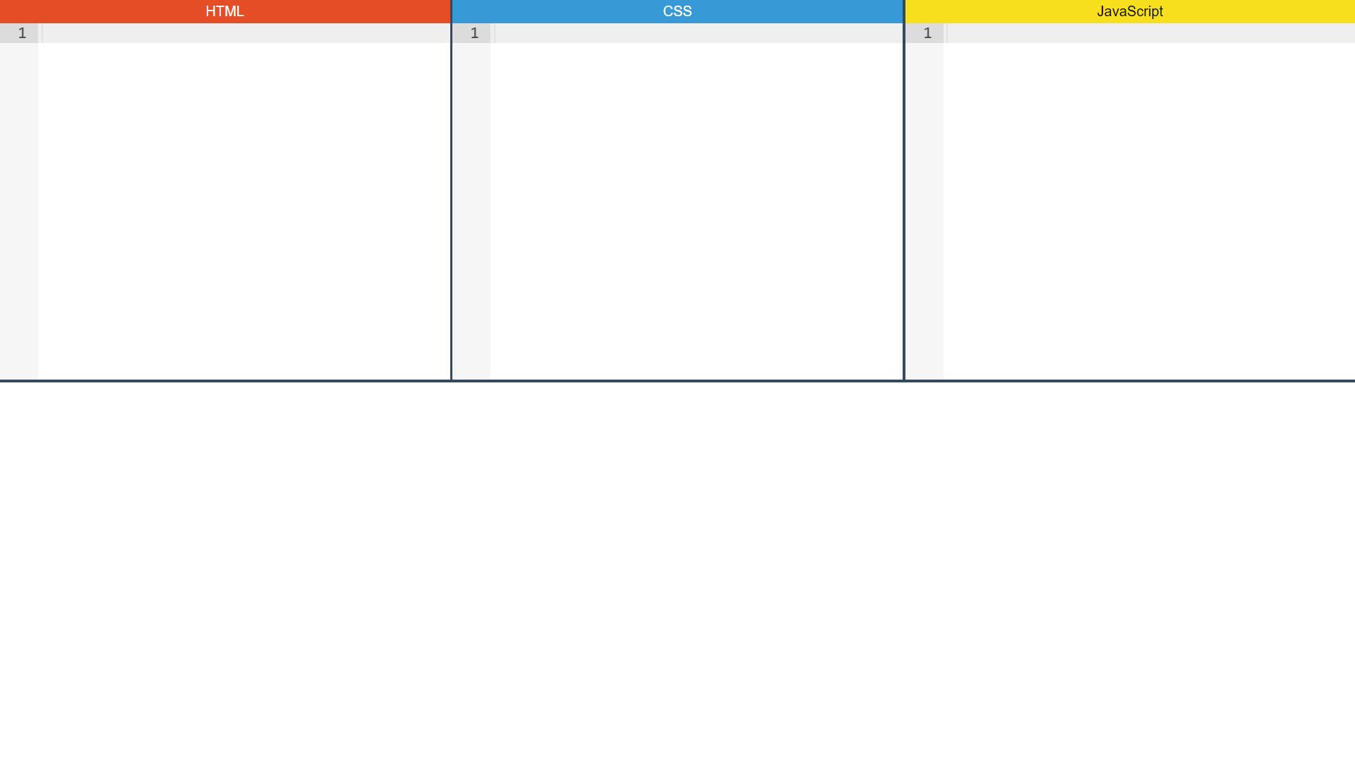
Save your changes to be graced with blazingly fast Vite dev server’s hot reload, as well as this view in the web browser:
Implementing results panel
While we can, technically speaking, edit the code, we’re still unable to see the resulting webpage. Let’s fix that - create a ResultsPaneContent.vue file in the components folder. In our script tag, we need to import and use the code store:
import { useCodeStore } from '@/stores/code';

const codeStore = useCodeStore();
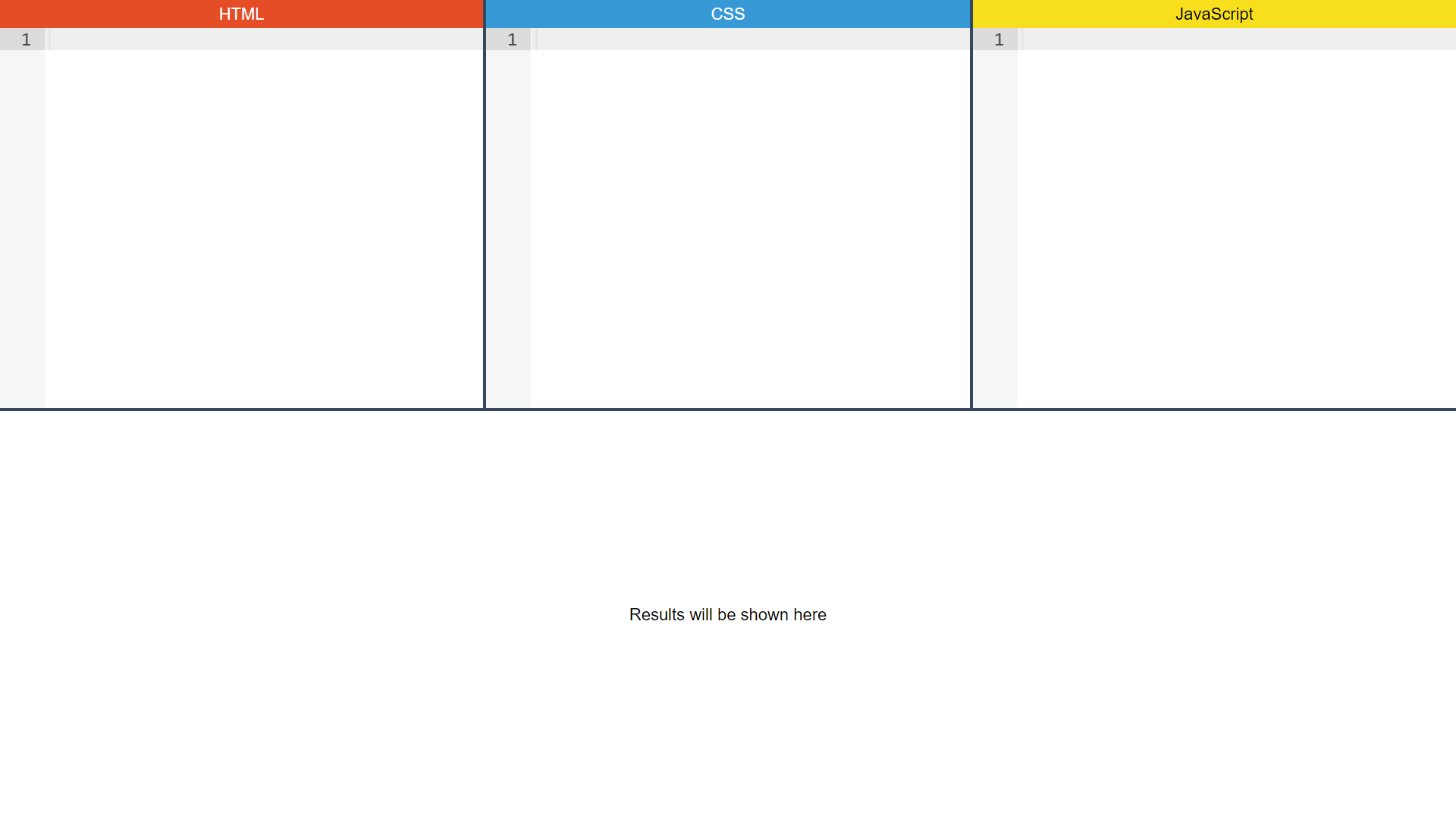
In the <template>, we should show a <span> with a generic Results will be shown here message if codeStore.isEmptyDocument is true, and an <iframe> with the codeStore.resultingDocument otherwise. Oh, and don’t forget about the necessary styles:
<span v-if="codeStore.isEmptyDocument">Results will be shown here</span>
<iframe
  v-else
  id="resulting-document"
  frameborder="0"
  allow="accelerometer; camera; encrypted-media; display-capture; geolocation; gyroscope; microphone; midi; clipboard-read; clipboard-write"
  allowfullscreen="true"
  allowpaymentrequest="true"
  allowtransparency="true"
  sandbox="allow-downloads allow-forms allow-modals allow-pointer-lock allow-popups allow-presentation allow-same-origin allow-scripts allow-top-navigation-by-user-activation"
  :srcdoc="codeStore.resultingDocument"
></iframe>

<style scoped>
#resulting-document {
  width: 100%;
  height: 100%;
}
</style>
As you’ve probably guessed, all these allow attributes enable certain features that would normally get blocked due to security concerns. It’s not that I’m disabling all the safeguards, I admit I’ve just shamelessly copied these from the OG CodePen, hahaha.
Here come the penultimate steps: go back to App.vue add id="results-pane" to the <Pane> element directly below the editor-splitpanes one, as well as this styling rule:
#results-pane {
  flex-direction: row;
  align-items: center;
  justify-content: center;
}
And at long last: import the ResultsPaneContent component...
import ResultsPaneContent from './components/ResultsPaneContent.vue';
... and place it in the results-pane:
<Splitpanes id="main-splitpanes" horizontal>
  <Pane>
    <Splitpanes id="editor-splitpanes">
      <Pane>
        <EditorPaneContent editor-lang="html" />
      </Pane>
      <Pane>
        <EditorPaneContent editor-lang="css" />
      </Pane>
      <Pane>
        <EditorPaneContent editor-lang="javascript" />
      </Pane>
    </Splitpanes>
  </Pane>
  <Pane id="results-pane">
    <ResultsPaneContent />
  </Pane>
</Splitpanes>
Make sure to save your changes... et voila:
🎉 YOU’VE FINISHED THIS TUTORIAL 🎉
Thank you so much for reading in! I hope that I’ve managed to properly showcase and guide you through the whole process of building a Vue project using interesting community components, and that you’ve enjoyed this ride too. I’m really looking forward to further exploring all the existing and upcoming Vue/Nuxt components, modules, plugins, etc. and building applications around them to finally write up everything from a game plan to a fully working demo.
But don’t click away just yet, because I’ve got one more thing waiting for you...
Building upon the foundation
You’ve probably heard of tutorial hell before. I myself have been in that place too, and it’s safe to say I don’t feel like going back there at all. So how did you get out of it then? - you may ask. The answer is: don’t jump into a completely new project straightaway. I’d highly recommend you analyse what you’ve just built, try modifying certain elements and observe how the app behaves after applying these changes.
Or better yet - think of the tutorial project as a baseline which you can expand on by implementing/improving certain functionality. So here’s a list of features you could add to this application:
- Project Autosave - I’m confident it’s self-explanatory. You’ll just need to register some kind of third-party persisted state Pinia plugin and you should be good to go, but bonus points if you write one yourself.
- Preference-based editor theme - and I’m obviously talking colour scheme preference here. You can default to the System setting, yet having the option to force Light/Dark theme independently on it would be very nice too.
- Adding external libraries via CDN links - while the core idea behind CodePen is throwing up smaller POCs and tech demos which require (almost) no dependencies, you’ve still got the choice to include them via
unpkg,jsdelivr, or other CDN links. Why should this project lack such functionality? - Switching to alternative layouts - as much as I’m a fan of the current layout, some folks might prefer other ones. I don’t see a reason behind being a ruthless dictator who’s forcing everyone else to use only one particular layout. Give us liberty!
- Bringing Emmet and popular key bindings to the table - apart from language service workers, Ace offers the so called extensions for the good ol’ Emmet, as well as popular editor keyboard shortcuts, including the likes of Visual Studio Code, Sublime Text, or even Vim. Would be worth implementing, especially if you regularly use the last one.
Of course, you could certainly come up with many more features or even turn this project into a fully fledged full-stack web app, but all the features I’ve listed should keep you busy if you really commit to the idea of treating each tutorial project as a foundation for your own application.
Thank you once again for sticking to the very end! Mac believes in you - remember that!